How to get those all-important email sign-up forms right

On average, I receive 190 emails every day to my personal account. I religiously use Gmail’s promotions tab to filter my emails. Every few days I’ll go through all the emails I receive and save any that I think either have a great subject line, great creative or something about it that shows off all the cool things that email can do. The disappointing thing is that there are so few great emails. Most are pretty dull, lacklustre and in some cases genuinely look like they are stuck in the 90s.
I recently decided that I wasn’t receiving enough emails so I signed up to a whole load more. The process was actually quite eye-opening. These were the retailers I chose to subscribe to:
| 1. Urban Outfitters | 2. Graze |
| 3. Hotel Chocolat | 4. Uniqlo |
| 5. Adidas | 6. Nike |
| 7. Reebok | 8. Allsaints |
| 9. Aldo | 10. Hugo Boss |
| 11. Office | 12. Cath Kidston |
| 13. Footasylum | 14. Charles Tyrwhitt |
| 15. Diesel | 16. Forever 21 |
| 17. Footlocker | 18. Fossil |
| 19. Havaianas | 20. Holland and Barrett |
| 21. Jack Wills | 22. Kuoni |
| 23. Molton Brown | 24. Levi’s |
| 25. Sweaty Betty | 26. Schuh |
Positioning of the sign-up
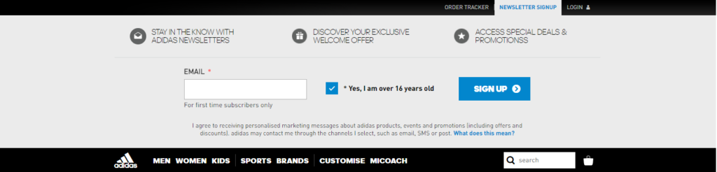
Uniqlo and Adidas were the only ones whose sign-up forms were at the top of their sites and above the fold. I really like the way Adidas used a drop down to display more information about the newsletters. They make it really clear why someone would want to sign up and it didn’t really affect the overall UX of the site.

The rest of the retailers all had sign-up forms at the bottom of their home pages. Unlike me, consumers are unlikely to proactively look for the sign-up forms, and I would suggest that retailers consider moving them towards the top of their home pages. It would even be worth replacing one of the hero banner images with a sign-up form, at least for a short while, because it’s a sure-fire way to net more sign-ups.
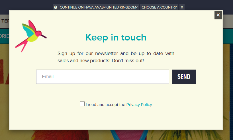
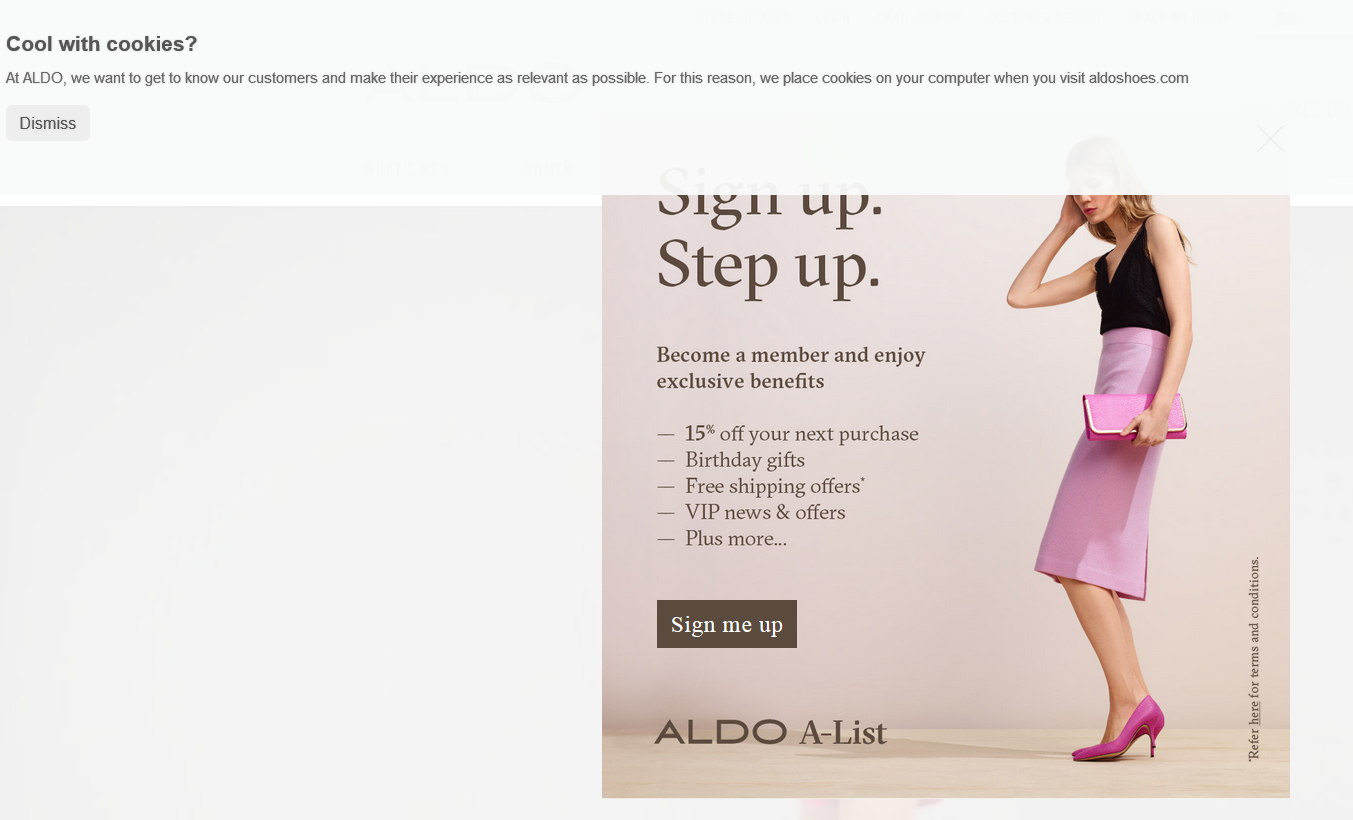
Aldo, Sweaty Betty and Havaianas were the only retailers to have a popover on the site. Unfortunately, Aldo’s popover coincides with its cookie message appearing at the same time, which detracts from the user’s experience of the site. What’s more, the brand doesn’t actually have the form on the popover and you still have to click through to a separate page. I think a wise move would be for Aldo to delay showing the popover timing for a few more seconds. Aldo clearly shows the benefits of signing up to its emails, although the amount of information asked is perhaps unnecessary in the very first instance and, to me, is a little off-putting.
I think Cath Kidston has a sweet and twee way of encouraging sign-ups, however it is lost somewhat among the rest of the floral products and branding on its site.

Additional data capture
With most of the retailers I wanted to receive emails from, once I had typed in my email address that was the end of the process. Those brands are losing a prime opportunity to find out more about their customers. However, some did ask for further information.
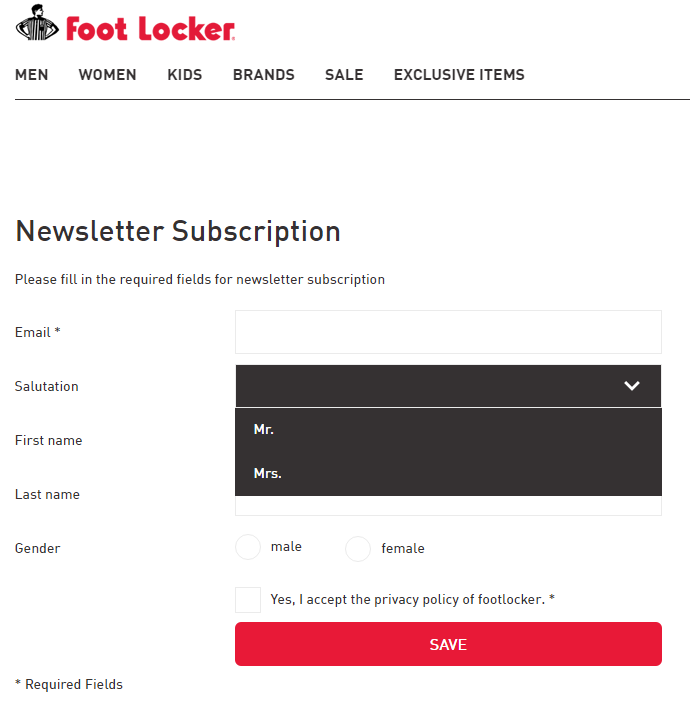
Footlocker had a bit of a title fail. Unfortunately, the only option you get is either Mr. or Mrs.
I tend to buy both men’s and women’s clothing. With a lot of these retailers I was only ever given the option to select one gender. Whilst it is a very simple and easy way to sign up, I feel that Allsaints could consider adding a “Both” option in its sign-up form.

Forever21 were the only ones that gave me the option of selecting both.
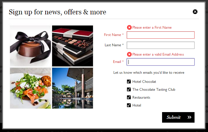
Once you’ve gone past the initial sign-up stage on Hotel Chocolat’s site, I like the company’s clear preferences option which allows me to select the types of emails I would like to receive.
Nike, surprisingly, was the only site where I couldn’t sign up – its “Sign up for email” page couldn’t be found. A huge lost opportunity to capture visitor’s emails – hopefully they get it up and running soon.
Conclusion and advice
- Put your sign-up forms near the top of your home page
- Use popovers in addition to a static sign-up page
- Use it as an additional opportunity to find out more from your contacts
- Tell your contacts the benefits for signing up
- Check regularly that your sign up form and page still works
Did you find this useful? Look out for my next blog post, where I’ll be discussing and critiquing welcome emails.