How to make your emails more engaging

What does an excellent email look like? And we mean look like.
Sure, we know targeting, automation, and personalization are essential for hitting goals, but visuals are the hook. In fact, people are 6.5 times more likely to remember your message if you show it rather than just say it.
So, take a second to look at your email template. Is it memorable? Does the design change how customers feel about your brand?
During my research for Dotdigital’s Hitting the mark report, I was inspired by what some brands are doing (and surprised by what many weren’t doing) and I want to share that with you.
To give you a quick hit of inspiration, I’ve rounded up the email design elements that leave a lasting impression on the reader. From countdown clocks and calls to action (CTAs) to interactive emails, here are the design features that make emails engaging.
1. Countdown clocks
Countdown clocks grab attention, inspire urgency, and drive sales. We often see them in ecommerce emails during sales, but that isn’t the only way to use them.
Here are a few ideas to get the creative juices flowing:
- Birthday treats: Build anticipation by counting down the days until loyal customers can expect a special gift
- Event reminders: Countdown to a reservation or event to encourage recipients to check directions or check-in details
- Shipping deadlines: Let shoppers know when the cut-off for seasonal shipping is approaching
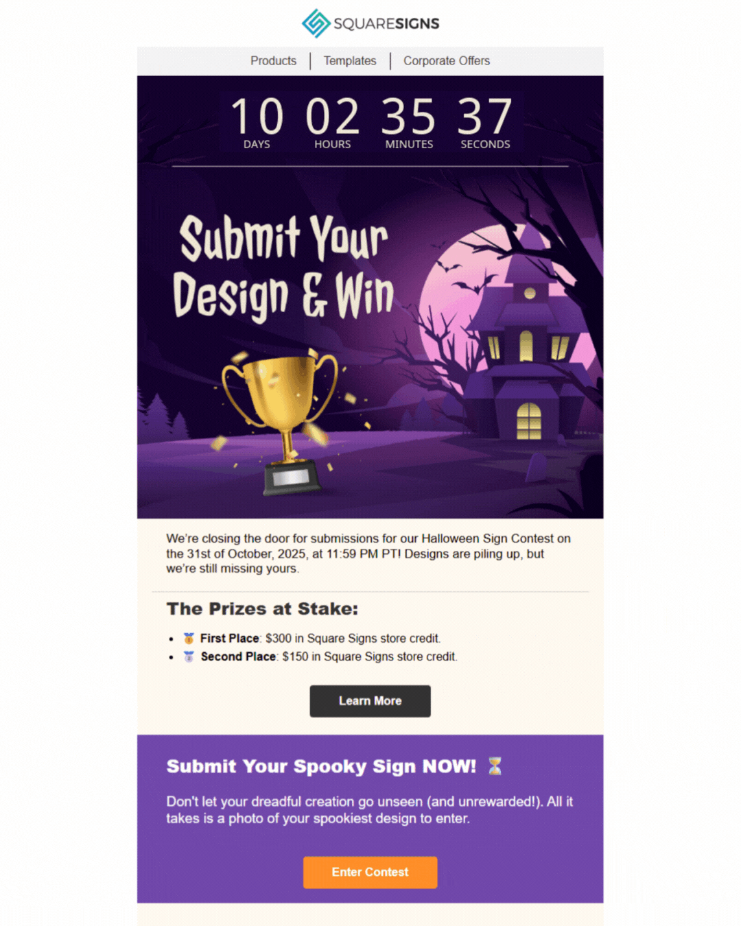
Why does this email work?
This email from B2B brand Square Signs proves that countdown timers aren’t just for retail. By using the timer to drive competition submissions, they prioritized engagement (rewarding creativity) over a hard sell. Plus, paired with a spooky Halloween theme, it sticks in the mind.
2. Social proof
Social proof (like reviews or star ratings) is essential for customers during the decision-making process. Customers want honest opinions from peers, not promises from brands. It all comes down to trust, and indecisive shoppers trust peers more than brands. So, try adding third-party blocks from platforms like Trustpilot or Feefo into your email campaigns to give uncertain shoppers that extra nudge.

Why does this email work?
Yes, this review block has a lot of copy, but the star rating and Trustpilot branding instantly build trust. Partnering with a recognized review platform helps to validate your message because the trust is already established between that brand and the customer.
3. Actionable CTAs
The most common CTAs we see are “shop now” and “buy now.” These are fine, but in a flooded inbox, they blend into the background. Plus, they focus on your goal, not the reader’s experience.
To create irresistible CTAs, experiment with language. If you’re in B2B or non-profit, “buy now” might not even apply, so try using phrases that focus on the value for the reader rather than the transaction:
- Browse the collection
- Take a closer look
- See what’s trending
- Check out the highlights
- Find your perfect match
- Build your wishlist
- Dive into the details
- Join the conversation
- Grab your discount
- Save your spot
- Get the guide
- Explore the full breakdown
- Join the club
- Earn more rewards
Once you’ve settled on your language, check the design. Is it a button or a text link? Does the color pop? Is it easy to tap on a phone? All of these are essential components to create an irresistible CTA.

Why does this email work?
This example from the England Rugby Club pairs varied CTAs with relevant content. It offers chances to buy tickets while keeping the focus on engaging the audience with exclusive information. The brand knows that if fans feel part of the experience, they become more loyal, high-value supporters later.
4. Quizzes
Another technique that stood out to me as part of my Hitting the mark research was the impressive use of fun quizzes. Beyond offering a unique experience (such as personalized product recommendations) quizzes can be a goldmine for data. They provide you with relevant insights that help build detailed customer profiles, which can, in turn, help shape future marketing decisions.
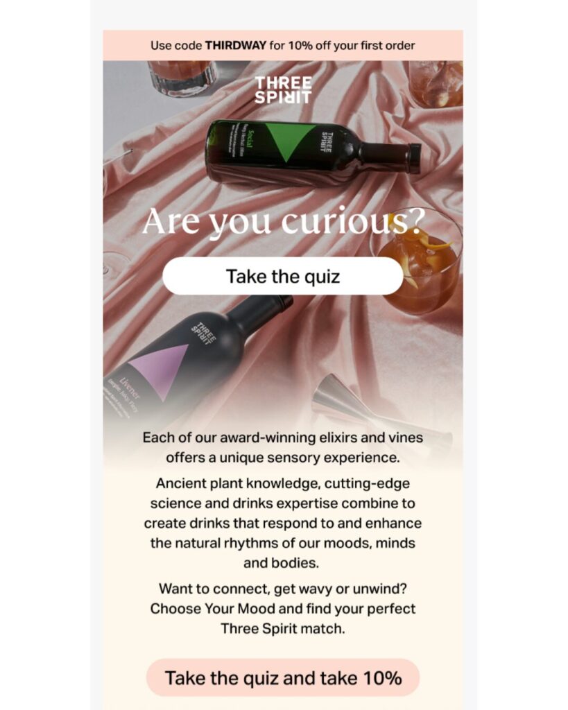
Why does this email work?
The goal here is to simply get recipients to take the quiz. Three Spirit uses a short explainer on why the reader should take it, followed by clear CTAs focused on the experience rather than the sale.
5. Videos and GIFs
We’re living in a video-first world. People spend about 141 minutes a day on social media, much of it watching Reels and TikTok videos. If a picture is worth a thousand words, a video is worth a million. It’s an effortless way to communicate without struggling to cut your copy down.
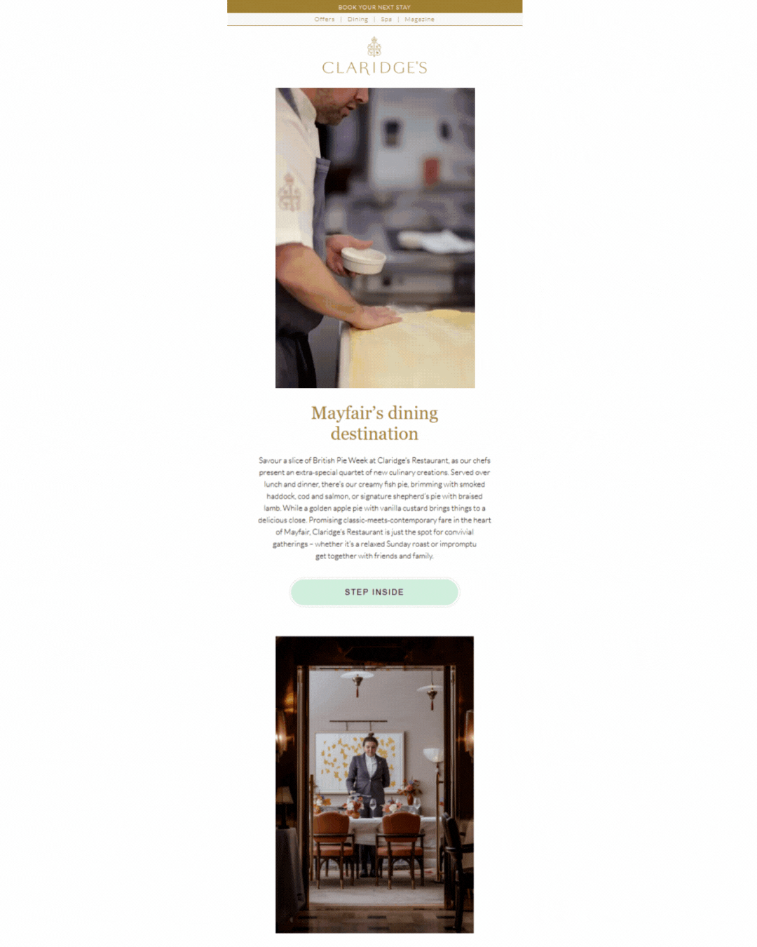
Why does this email work?
Claridge’s Hotel in London communicates the care and dedication of its kitchen staff in this simple 20-second video that gives subscribers a unique behind-the-scenes look at the food awaiting them. I also love that they paired the video with a text explanation of the dishes, ensuring the email remains accessible to everyone.
6. Interactivity
The ultimate goal of email marketing campaigns is to drive the recipient to the next stage of engagement, but to get that engagement, you need to stop the scroll.
Adding interactive elements to your email transforms a static message into an engaging experience. It stops subscribers from flicking past you and buys valuable time in the inbox to make an impact. By prioritizing a customer-first experience in the inbox, you’re building the kind of deep engagement that makes them want to continue their journey with you.
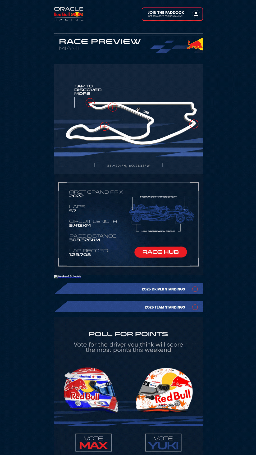
Why does this email work?
This is a fully immersive experience. By letting fans explore the racecourse directly in their inbox, the reader gets exclusive insights on where to watch on race day. These customer-first experiences drive loyalty and long-term value.
7. Year in review
Spotify has proved that data can be a real conversation starter. Spotify Wrapped is a hotly anticipated moment in the calendar for brands and customers, but for Spotify, there’s a bonus benefit: it unites the community. Having a happy community of customers is key to improving average order value (AOV) and customer lifetime value (CLV), and “year in review” emails are perfect for that because they deliver memorable, shareable content.
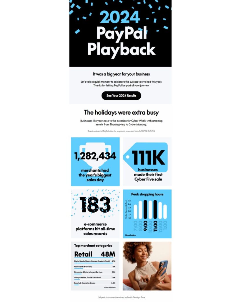
Why does this email work?
Paypal’s infographic style makes valuable info highly consumable. While this example is a general business overview, the CTA drives recipients to check their personalized results. It’s community building wrapped in a personalized bow.
8. Footers
Footers are often overlooked, but they deserve some TLC. In my Hitting the mark analysis, I found many brands stuck to standard, out-of-the-box footers. A thoughtfully designed footer can address blockers for customers not yet ready to buy, so when you’re building your email templates, think about the key links that will improve the customer experience.
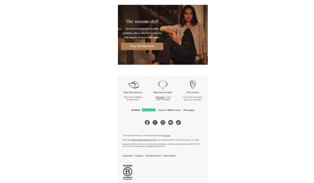
Why does this email work?
This is an excellent example of a footer that removes barriers to conversion. Visual cues deliver essential info about delivery and store locators, while the Trustpilot rating and B Corp Certification build trust in every single send. Small touches like this have a big impact.
Bonus: Accessible design
Accessibility isn’t a “nice-to-have.” One in six adults has a disability, making accessibility a design principle you shouldn’t ignore. Despite this, the Email Markup Consortium(EMC) found that a shocking 99% of emails contain “serious” or “critical” issues.
In Hitting the mark, only 10% of brands met best-in-class accessibility standards. To get a full breakdown of how to create accessible templates in minutes, check out our latest accessibility blog, but first, let’s look at who’s getting it right.
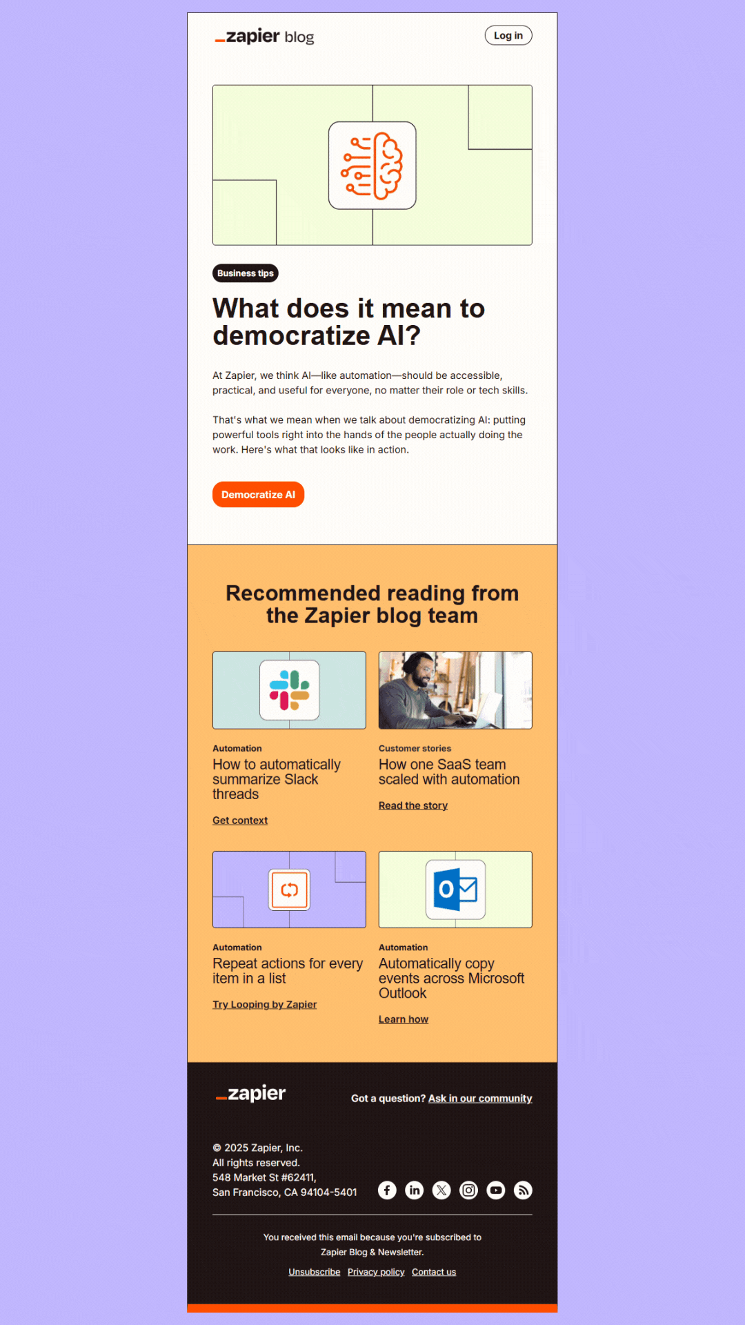
Why does this email work?
Zapier ticks almost every box with this email. The high contrast between the background and text makes it readable; the message remains clear even with images off (which is vital for screen readers) and the CTAs are descriptive and actionable. The only thing missing is alt text for the images, but since the copy covers the critical info, readers won’t miss out.
Ready to make your emails stand out?
I hope these examples sparked some ideas for your next campaign. You don’t need to reinvent the wheel; just a few tweaks to your visuals, CTAs, or adding in some interactivity can make a massive difference in how your audience connects with your brand.