10 mistakes to avoid when building email templates

There’s no doubt that successful business relies on email templates. This might not first spring to mind, but effectively communicating and interacting with your customers relies on both the frame and contents of your email marketing campaigns. With email templates, it’s crucial to convey your messages in a clear and direct way so that recipients understand what you’re trying to say.
Email marketing is one of the most widely used forms of communicating targeted messages to the target audiences of any business. That’s hardly surprising when its ROI is 4200%. The beauty of email is that it allows any business to scale its messaging, broadcasting its brand to the masses so to attract people in the market for its products and services. Marketers can personalize content and segment contacts based on everything from demographics to preferences and website behavior. This data-driven approach makes messages more relevant.
As a marketer, it’s your job to showcase your brand – and your email marketing template is the best way of doing that in the inbox. What’s more, keeping it simple but on brand means that recipients can engage with your messaging more easily – recognizing who you are and what you want, quickly. It’s important for your templates to be dynamic and flexible, helping you adjust your strategy as the goalposts move.
10 tips for email template success
In this blog, we’re going to look at 10 mistakes to avoid by using email best practice when building your email templates, as part of an effective marketing strategy.
1. Be on brand: but less is more
Email’s place in marketing is to turn interested subscribers into serious prospective customers. Initial success often depends on the way email design looks and feels, plus other delivery metrics (you’ve got to get the email in the inbox in the first place!). When building your email template, experiment with your brand’s color palate, but remember: less is more. You don’t want to detract from the overall message. The key here is the placing of your copy and call to action. Make sure the content can breathe within your design!
2. Get the length right
We’ve all read countless articles about optimum email length. Well, there’s isn’t one. What’s right for one brand won’t be right for another. So, my best recommendation is this: provide quality and not quantity. Say what you need to say in as few words as possible. Providing less information doesn’t mean being unclear; there’s more impact articulating your message concisely, because it prompts subscribers to engage faster. People don’t have time to read blocks of paragraphed text – so brevity is key. Don’t forget you can use images to convey what you want to say, too.
3. Tone of voice is everything
Talk like a human and not a business. This is the best piece of marketing advice out there. Similar to the above point, you don’t want to inundate your readers with heavy complex jargon – talk to them as you would a friend. Be authentic in your style of writing, keeping language simple and on brand. Don’t be abstract, or too academic – no one has time for BS. A message of twenty-four words with a compelling CTA gets customers to your site faster than long, uninterrupted sentences lacking proper punctuation. Once subscribers reach your site, they can add comments, interact, or even buy something. Huzzah!
4. Include testimonials, please
We live in a world where social proof is everywhere and everything. I don’t know about you, but whenever I visit a new city I only go to restaurants that have been highly reviewed. The same goes with shopping online; I instinctively head to the reviews section to read other people’s experiences, which all have an impact on my decision to buy. Because at the end of the day, we trust other humans because they’re essentially the same as us. So, next time someone questions including testimonials in your email campaign, kindly remind them about that time you obsessively read reviews for three hours before hitting ‘buy now’.
5. Test your subject lines for goodness’ sake
If testing isn’t already ingrained in your marketing strategy then please download this testing worksheet and fill it out immediately. The success of your campaigns hinges on the subject line; because if the text doesn’t resonate with the recipient then they’re not going to open the email. And after all that work on the data, copy, and creative – you don’t want that! A/B test to see which version is more popular with your audience. For more tips on writing subject lines that generate email opens, check out our killer infographic.
6. Don’t overdo the imagery
Peppering your email template with too many images runs the risk of several things:
- It can detract from your overall message
- Imagery can block the call to action and delay engagement
- With images not turned on in email clients by default, emails with a full-length image (which look awesome) won’t show, robbing the message of any relevancy and context
- Too much imagery can increase the size of emails, which might become more susceptible to spam
Like all things in life, everything in moderation.
7. Make the unsubscribe link visible
Every email legally must include an unsubscribe link. There’s nothing more annoying for a frustrated subscriber than scrolling an email in search of that link. Unsubscribing should be effortless and it’s important to welcome feedback so you can improve on your content and email campaigns. Rather than including the link at the very bottom, consider placing it at the top. While you don’t want people to unsubscribe right away, people will tend to scroll first – so the unsubscribe link will only be visible for a short time before people start engaging with your first-rate content!
8. Preheader text is handy, so use it
The almighty preheader, albeit often neglected, is a useful bit of text that you can use to describe the contents of your email campaign. There are two reasons why you should populate it:
- The copy supports what you said in the subject line (it’s a great way to add extra info)
- If you don’t use it, it can auto-populate with random code from the first few lines of your email (which is can look ugly, making your super-duper email campaigns look unprofessional)
9. View-in-browser links are there for a reason
Any marketer knows that no amount of planning and testing can prepare for what will actually happen after you hit the send button. Whatever that may be, including a view-in-browser link is a simple way for recipients to view the contents of your email in a browser. Images might not show or, heaven forbid, there could be a horrific design glitch. Don’t let these possibilities detract from the subscriber’s overall email experience – prompt them with a link to where they can view the email in all its glory.
10. Okay, there isn’t a 10
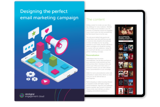
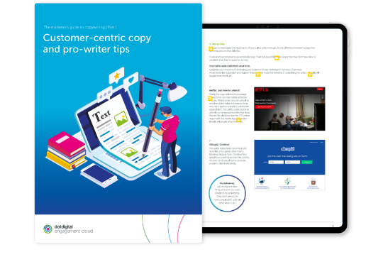
But instead – and rather more excitingly – I’m recommending these two bits of content to help you improve your email marketing templates (the latter is the first part of a series of three).
- Designing the perfect email campaign:

- The marketer’s guide to copywriting:

Winning email templates
All in all, email is your vehicle to marketing your products, services, and events. And at the heart of that strategy is your email template: how you structure copy and imagery, letting the data and message come alive. Following these simple tips (or rather, avoiding the all-too-easy mistakes) means your campaigns have the best chance of engaging your audiences and converting prospects into buying customers.


