
At best, that’s frustrating for your reporting efforts. At worst, you’re failing on decisions that could impact your business.
To help improve the usability of reporting in Dotdigital, we have decided to update our data ink colors. ‘Data ink’ here means the important detail you read from charts, dashboards, and reports.
Meet our new palette, Viridis. Coming to Dotdigital on July 3rd.
What was wrong with the old colors?
In data-ink terms, color should be about function not aesthetics.
What looks pleasing to the eye, or adheres to brand guidelines, is rarely what is needed to convey or enhance information.
Dotdigital’s previous reporting data ink used a combination of brand colors (pink and green) along with some generic colors. The charts looked on brand and the colors were distinct.
However, the palette had some problems:
- It didn’t work for people with colorblindness
- Greyscale printing became impossible to read because the palette didn’t have a uniform luminance gradient; which determines the perceived brightness of colors
- Colors were not perceptually uniform. Simply put: a change of the same amount in a color value should produce a change of about the same visual importance
- Colors used for data ink should be able to show that something is less than, more than, before, or after, another value
- The previous palette could not show clear graduations of good and bad (diverging values) on the same chart
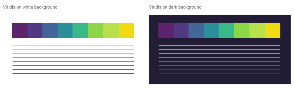
- The palette didn’t transition to a dark background. We wanted our charts to be easy to embed in our users’ presentations, whether they used a light or dark background
Viridis is a better color palette for data
With those thoughts, we are adopting Viridis for our data ink. The color palette was created by Stéfan van der Walt and Nathaniel Smith and is popular with data scientists.
As well as solving the specific data visualization challenges within Dotdigital’s reporting, Viridis also met the challenges around accessibility and colorblindness.
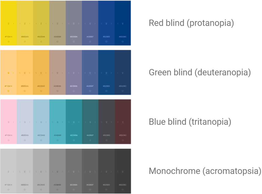
As you can see, irrespective of the type of colorblindness, the sequence of the colors is still understandable. For an eight-color diverging spectrum, that’s a huge achievement.
This is a hugely positive change, with benefits both to the increasing power of our data visualization and who you can share those visualizations with. Look out for these changes coming to Dotdigital on July 3rd.
For a sneak peek on what we’re working on, check out our roadmap here.
